在创建网页的过程中,你可能想要圆角,但常规的方法是使用多张背景图片,将图片剪下来(将设计思想剪成图片,以便更容易将其变成页面) ),还有一种方法可以让它变圆。 )。 CSS3出现后,你不需要做太多事情。CSS3提供了一组属性来设置元素的圆角效果:
- border-top-left-radius:设置元素左上角的圆角效果。
- border-top-right-radius:设置元素右上角的圆角效果。
- border-bottom-right-radius:设置元素右下角的圆角效果。
- border-bottom-left-radius:设置元素左下角的圆角效果。
- border-radius:上面四个属性的简写,允许您同时为元素的所有四个角设置圆角效果。
上述函数的可选值如下表所示。
| 价值 | 解释 |
|---|---|
| length | 为单位添加值以定义圆角的形状 |
| percentage | 将圆角的形状定义为百分比 |
边界-*-半径
通过上面的介绍,我们可以看到,border-*-radius这组函数可以给元素的四个角分别设置圆角效果,函数的语法形式如下:
边框-*-半径:[ <长度> | <百分比> ]{1,2}
该语法意味着您必须为 border-*-radius 属性指定 1-2 个参数,并使用空格分隔参数。第一个参数表示圆角的水平半径或半轴,第二个参数表示圆角的垂直半径或半轴。如果省略第二个参数,则按原样使用第一个参数的值。 。
[标题id =“attachment_740”对齐=“aligncenter”宽度=“410”] 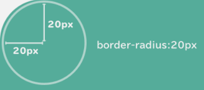 图表:元素的四个角[/标题]
图表:元素的四个角[/标题]【示例】使用四个 border-*-radius 属性来设置元素的圆角效果。
 <!DOCTYPE html>
<html lang="ja">
<head>
    <style>
        div {
            width: 350px;
            height: 100px;
            padding: 15px 0px 0px 25px;
        }
        .one {
            border-top-left-radius: 2em 0.5em;
            border-top-right-radius: 1em 3em;
            border-bottom-right-radius: 4em 0.5em;
            border-bottom-left-radius: 1em 3em;
            background-color: #CCC;
            margin-bottom: 10px;
        }
        .two {
            border-top-left-radius: 2em;
            border-top-right-radius: 2em;
            border-bottom-right-radius: 2em;
            border-bottom-left-radius: 2em;
            background-color: #888;
        }
    </style>
</head>
<body>
    <div class="one">
        border-top-left-radius: 2em 0.5em;<br>
        border-top-right-radius: 1em 3em;<br>
        border-bottom-right-radius: 4em 0.5em;<br>
        border-bottom-left-radius: 1em 3em;
    </div>
    <div class="two">
        border-top-left-radius:2em;<br>
        border-top-right-radius:2em;<br>
        border-bottom-right-radius:2em;<br>
        border-bottom-left-radius:2em;
    </div>
</body>
</html>
执行结果如下图所示。
[标题id =“attachment_741”对齐=“aligncenter”宽度=“1024”] 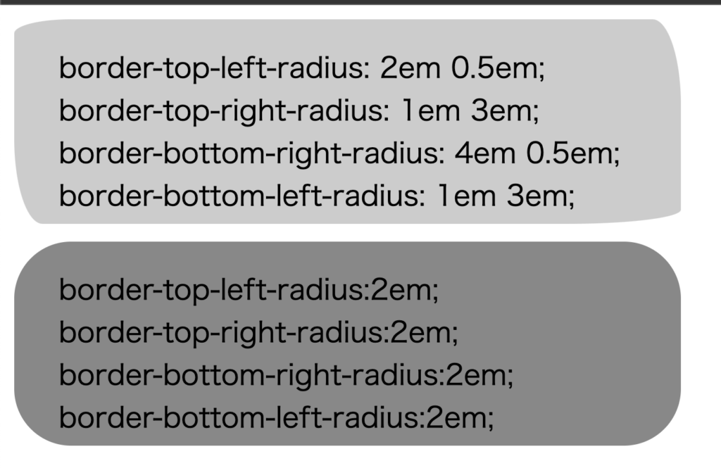 图:border-*-radius属性演示[/caption]
图:border-*-radius属性演示[/caption]边界半径
border-radius 属性是可以设置的四个属性的缩写: border-top-left-radius 、 border-top-right-radius 、 border-bottom-right-radius 、 border-bottom-left-radius 。同时使用 border-radius 四个 border-*-radius 属性。 border-radius 属性具有以下格式:
边框半径:[ <长度> | <百分比> ]{1,4} [ / [ <长度> | <百分比> ]{1,4} ]
语法解释如下:
- border-radius 属性可以接受两组用斜杠
/分隔的参数。每个参数集可以有 1 到 4 个参数值。第一组参数表示半径或半轴。第二组参数表示圆角的垂直半径或半轴,如果省略第二组参数的值,则直接使用第一组参数的值。这组参数。 - 在第一组参数中,如果指定了所有四个参数,则按以下顺序应用元素的四个角:左上、左上、右上、右上、右下、右下。 -left left-left; 如果指定三个参数,第一个参数作用于元素的左上角,第二个参数作用于元素的右上角和左下角,第三个参数作用于左上角元素的角会影响 的左上角。作用于元素右下角的右下角。如果指定两个参数,第一个参数作用于元素左上角的左上角和右下角,第二个参数作用于元素的左上角。 – 元素右上角的右侧和左下角的左下角;如果只指定一个参数,则该参数同时作用于元素的所有四个角。
- 第二组参数也遵循第一组参数的规则,但作用方向不同。
[示例] 使用 border-radius 属性设置元素的圆角效果。
 <!DOCTYPE html>
<html>
<head>
    <style>
    ul {
        margin: 0;
        padding: 0;
    }
    li {
        list-style: none;
        margin: 10px 0 0 10px;
        padding: 10px;
        width: 200px;
        float: left;
        background: #bbb;
    }
    h2 {
        clear: left;
    }
    .test .one {
        border-radius: 10px;
    }
    .test .two {
        border-radius: 10px 20px;
    }
    .test .three {
        border-radius: 10px 20px 30px;
    }
    .test .four {
        border-radius: 10px 20px 30px 40px;
    }
    .test2 .one {
        border-radius: 10px/5px;
    }
    .test2 .two {
        border-radius: 10px 20px/5px 10px;
    }
    .test2 .three {
        border-radius: 10px 20px 30px/5px 10px 15px;
    }
    .test2 .four {
        border-radius: 10px 20px 30px 40px/5px 10px 15px 20px;
    }
    </style>
</head>
<body>
    <h2>水平と垂直の半径が同じ場合:</h2>
    <ul class="test">
        <li class="one">1つのパラメータを提供<br>border-radius:10px;</li>
        <li class="two">2つのパラメータを提供<br>border-radius:10px 20px;</li>
        <li class="three">3つのパラメータを提供<br>border-radius:10px 20px 30px;</li>
        <li class="four">4つのパラメータを提供<br>border-radius:10px 20px 30px 40px;</li>
    </ul>
    <h2>水平と垂直の半径が異なる場合:</h2>
    <ul class="test2">
        <li class="one">1つのパラメータを提供<br>border-radius:10px/5px;</li>
        <li class="two">2つのパラメータを提供<br>border-radius:10px 20px/5px 10px;</li>
        <li class="three">3つのパラメータを提供<br>border-radius:10px 20px 30px/5px 10px 15px;</li>
        <li class="four">4つのパラメータを提供<br>border-radius:10px 20px 30px 40px/5px 10px 15px 20px;</li>
    </ul>
</body>
</html>
执行结果如下图所示。
[标题id =“attachment_742”对齐=“aligncenter”宽度=“1007”]  图:border-radius属性演示[/caption]
图:border-radius属性演示[/caption]通俗易懂的解释“CSS圆角(border-radius)已彻底解决”!您必须观看的 2 个最佳视频
CSS Border
Css border-radius and border#html #css #programming #youtube


![2021 年如何设置 Raspberry Pi Web 服务器 [指南]](https://i0.wp.com/pcmanabu.com/wp-content/uploads/2019/10/web-server-02-309x198.png?w=1200&resize=1200,0&ssl=1)

