The opacity property is provided in CSS to set the transparency of an element. This works not only for colors, but also for images and other elements on the page. Its syntactic form is:
opacity: number;
Among these, number is a floating point number (decimal number) from 0 to 1 that represents the transparency of the element, and the smaller the value, the higher the transparency (0 is completely transparent, 1 is completely opaque).
Additionally, when using the opacity attribute, keep in mind the following:
- If an element defines an opacity attribute and its value is less than 1, its child elements will also have the same transparency.
- If the other elements are unplaced elements, this element has a higher stacking level than the other elements.
- If the defined opacity attribute value exceeds the specified range, intercept the closest value. For example, 1.5 is intercepted as 1.
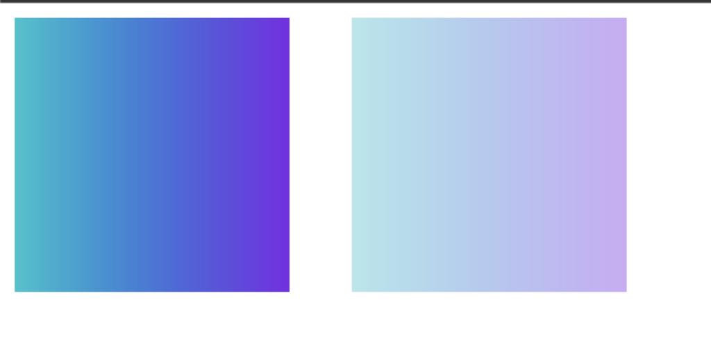
[Example] Use the opacity attribute to set the transparency of an element.
 <!DOCTYPE html>
<html>
<head>
    <style>
        .img {
            width: 150px;
        }
        .img:last-child {
            opacity: 0.4;
            margin-left: 30px;
        }
    </style>
</head>
<body>
    <img src="./css.png" alt="" class="img">
    <img src="./css.png" alt="" class="img">
</body>
</html>
The execution result is shown in the figure below.
IE8 and earlier versions of IE browsers do not support the opacity attribute. If you want to achieve transparency in these browsers, you can use the filter attribute. The syntax is:
filter: alpha(opacity = number);
The value range for number is 0 to 100, with lower values being more transparent.
[Example] Setting the transparency of an element using the filter attribute:
 <!DOCTYPE html>
<html>
<head>
    <style>
        img {
            width: 150px;
        }
        img.image_two {
            filter: alpha(opacity=50);
            margin-left: 30px;
        }
    </style>
</head>
<body>
    <img src="./css.png" class="img_one">
    <img src="./css.png" class="image_two">
</body>
</html>
The execution result is shown in the figure below.

To enable transparency in all browsers, you can define opacity and filter properties at the same time:
p {
opacity: 0.5;
filter: alpha(opacity=50);
}


![How to set up a Raspberry Pi web server in 2021 [Guide]](https://i0.wp.com/pcmanabu.com/wp-content/uploads/2019/10/web-server-02-309x198.png?w=1200&resize=1200,0&ssl=1)

")


 in Roblox")
")


")


")


")
