Color and visuals are powerful methods for effective communication.
In fact, colors influence people’s mood, behavior, and emotions. Therefore, it can impact your branding and marketing.
Therefore, it is important for product designers to use color carefully and purposefully. But how do you know which color or set of colors to use for your products, branding, and marketing?
What color best represents your purpose and captures the consumer’s attention?
Learning color theory will help you understand it. This theory includes cultural associations, human perception, and color psychology.
In this article, we will explain the relationship between color theory and color psychology, the models included in them, and more.
Let’s get started!
What is color theory?
Color theory is a vast field of knowledge that includes rules and guidelines for different color combinations and their uses. It helps you create smart and effective designs.
Color theory is an important part of human-computer interaction. This is similar to other elements such as typography, where designers need to choose colors carefully. In this theory, you will learn how to use color combinations to successfully communicate with your customers and users through different color schemes in your visual interface.
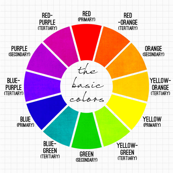
There is a color wheel to help you choose the right color combination for your application. In 1666, Sir Isaac Newton invented the concept of the color wheel and established the theory of color. He classified colors into three groups.
- Primary (red, blue, yellow)
- Secondary (combination of primary colors)
- Tertiary colors (combination of primary and secondary colors)
This classification helps users distinguish between colors according to their needs. It also has properties such as:
- Hue : Appearance (e.g. red)
- Chroma : purity (for example, if a color has shades, black is added; if a color has tints, white is added; if a color has tones, gray is added)
- Lighting : How saturated or pale does it look?
How does color psychology relate to color theory?
Color psychology is an important part of learning color theory. When you, as a designer, choose a UX color palette for your product, you typically have in mind what the product visualizes. But it’s equally important to think about emotions.
Colors have a strong psychological impact on the human brain. Each color represents a different emotion or meaning for the user. Now, there is no special meaning in the colors that suit everyone perfectly.

Think about how colors evoke emotions in most people.
- Red : Red represents importance, love, and danger. It is also known as the color of energy. Just staring at this color increases your pulse, heart rate, and metabolism. Red is the perfect color to quickly grab the attention of your visitors. You can use it to highlight important elements on a web page.
- Green : Green represents success, character, and growth. For example, it is a great color for environmentally friendly products. This is a popular color that many professionals use in their interfaces to let users know that an operation has completed successfully.
- Orange : Orange represents fun, optimism, and energy. It gives you an energetic and positive vibe. Many companies use this color on their cheap products to highlight the lowest prices on their e-commerce stores.
- Blue : Blue represents comfort, calm, relaxation, and trust. People generally have a positive impression of blue and a sense of inner security, which is why brands trust this color.
- Yellow : Yellow represents warmth, attention, and happiness. Colors can be seen even from a distance. For this reason, they are often used on taxis and banners to attract customers from far away.
- Purple : Purple represents wisdom, creativity, and luxury. It is usually associated with luxury and royal products.
- White : White represents health, innocence, and cleanliness. It often makes us think about a healthy and normal lifestyle. This color is widely used in the medical industry to suggest product safety. It is also used in other industries to represent simplicity.
- Black : Black represents sophistication, mystery, and strength. Most brands limit black to accents and text. Black has a luxurious feel and is a color that stands out on fashion sites.
We recommend using different colors depending on gender and age. Before deciding on a color preference, you need to find out who your customer is.

To match gender and color in general, you should consider the following:
- Blue is most preferred by men, but also by some women.
- Girls choose pink as their favorite color.
- Yellow, orange, and brown are generally not colors chosen by men or women.
- Men prefer calm, contrasting and bright colors. Women prefer soft colors.
Similarly, color psychology is also related to age and color. Young people always prefer colors with longer wavelengths, such as bright colors. However, older people choose shorter wavelengths.
Understanding the psychology of colors will help you better use the right colors in your UI design. Here are some tips to help you do this.
- Use a mood board to choose the right colors.
- Create a focal point with color.
- Decide when and how to use soft, vibrant colors.
- Always remember accessibility.
- Avoid text with low contrast.
color model
Before you start combining colors, you need to learn about the different properties of colors. The first is the visible color, which is the surface of an object, and the second is produced by light, such as the beams from a television.

These properties create two models that form the color wheel.
- additive color model
- subtractive color model
#1.Additive color mixing model
This model considers red, blue, and green to be primary colors. Therefore, this is known as the RGB color system. All colors you see on screen are generated from this model. When these primary colors are combined in equal proportions, secondary colors such as magenta, yellow, and cyan are produced.
The more light colors you add, the brighter and brighter the colors will become. Adding color brings it closer to white. For computers, it is created using a scale of 0 to 255. Black has R=0, G=0, B=0, and white has R=255, G=255, B=255.
#2.Reduced color model
This model obtains color by subtracting light. Contains two color systems. The first is RYB (Red, Yellow, Blue), also known as the art system used in art education. This is the basis of modern color theory, which states that cyan, magenta, and yellow are an effective color combination.
The second is the CMY color model, which is used specifically in printing. If black ink is included in photochemical printing, it is changed to a CMYK model of cyan, magenta, yellow, and black. The closest shade to black will be a muddy brown.
CMYK works on a scale of 0 to 100. If C=100, M=100, Y=100, K=100, it will be black. If C=M=Y=K=0, it will be white.
Color wheel basics
Understanding the color wheel can be as exciting as a new packet of crayons. Understanding the processes and terminology involved in color makes it easier to communicate your needs and vision to printers, designers, and others.
Professionals, artists, and designers use this concept to develop color schemes. The wheel consists of primary, secondary, and tertiary colors. By drawing a line through the center of the color wheel, you can separate cool colors (various blues, greens, and purples) from warm colors (various reds, oranges, and yellows).

Cool colors are often associated with calm, serenity, and peace, while warm colors are often associated with brightness, action, and energy. Selecting color combinations on a computer requires a wide range of color combinations, more than 12 colors.
The color wheel concept requires you to be aware of color temperature to understand how cool and warm colors affect your logo design and brand impression.
Visualizing colors within the wheel is easy and can help you choose the right color scheme. It describes how one color relates to its neighbors on a color scale made up of the colors of the rainbow (red, orange, yellow, green, blue, indigo, and violet). Show.
The wheel allows you to mix gray, black, and white with the original colors to create lighter, softer, darker, or lighter colors. These mixtures create the following color variations:
- Hue : All primary and secondary colors are hues on the color wheel. Hue is an important term to remember when combining primary colors to create secondary colors. Hues contain other colors within them, so two primary hues must be used and mixed to produce a secondary color hue.
- Shade : Shade is a general term for darker and lighter versions of a hue. Technically, it’s the color you get when you add black to a given hue. For example, red + black = burgundy.
- Tone : Tone, also known as saturation, can be created by adding white and black (or gray) to a color. Saturation is often used in creating digital images.
- Tint : Tint is the opposite of tint. Here we need to add white to the color in order to have different shades and tints in the resulting color. For example, red + white = pink.
color scheme

To optimize the user experience, you should place colors strategically within your images. The color selection used in the attractive interface has high usability.
Here are the different color schemes:
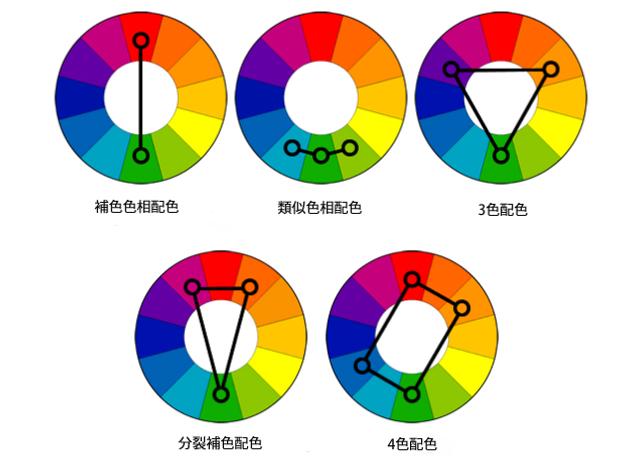
#1.Single color
A monochromatic color scheme uses a single color in various shades and shades to produce a consistent look and feel. It often looks well polished and very clean due to the lack of color contrast.
You can easily change the brightness or darkness of the color. They are often used for graphs and charts, but creating graphs does not require high contrast colors.
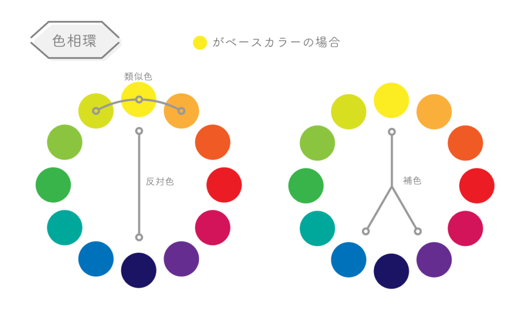
#2.Similar
Analogous color schemes pair one dominant color with two adjacent colors on the color wheel. If you want to use a 5-color scheme, you can add other colors next to the outer color.
It is used to create softer designs with less contrast, as it does not create themes with high contrasting colors. This color scheme creates a cool (blue, green, purple) or warm (yellow, red, orange) color palette. It is often used to design images instead of bar charts or infographics.
#3.Complementary
Complementary color schemes use two colors that are opposite each other on the color wheel and their related shades. Achieves high color contrast. Care should be taken when using this scheme, as it increases the contrast.
Additionally, it’s great for graphs and charts. High contrast allows you to highlight important marks and points.
Apart from the three main color schemes, other color schemes are used to generate the best ever color options for infographics, charts, graphs, and images. They are:
- Complementary color split: Contains one primary color and two other colors that are directly adjacent to the complementary color of the first color. It takes time to create because it is difficult to balance.
- Triadic: Provides a high-contrast color scheme while maintaining the same color tone. It is created using three colors evenly spaced on the color wheel.
- Square: This scheme uses four colors placed equidistant from each other in the color wheel. This can be very helpful in getting people interested in web design.
- Rectangle: Also called quartic color scheme. The rectangular approach is supposed to be similar to the square approach, but requires a more subtle approach to color selection. You’ll have more flexibility in choosing the right colors for the graphics you need.
Advantages of color theory
Color is more important and plays a vital role in our visual experience.
Let’s see how.
- People value visual elements more when purchasing products.
- People subconsciously form judgments about products within seconds of first seeing them. More attractive products can be sold within minutes.
- Color increases brand awareness.
- Seeing is believing, therefore, a captivating colored picture is worth a million words. Color helps people process images and store them in memory efficiently.
Therefore, product owners and designers must pay attention to color theory when working on branding, marketing, and sales.
How does color theory influence the choices of designers and marketers?
UX design requires designers to have a solid understanding of this theory in order to create meaningful and harmonious user designs.
Color theory is therefore both the art and science of using colors. Learn how humans think about colors, the visual effects of color combinations, and how colors contrast and harmonize. Research shows that it takes just 90 seconds for people to make a subconscious decision about a product.
Therefore, the right combination of colors can help improve product conversion and usability. Colors make us feel relaxed, passionate about something, and inspire us to take action. Tell a story about your product.
You can judge products with color visuals. Take the example of Mountain Dew, a fresh energy drink. To justify its tagline, the company has chosen its colors very wisely. Namely, it’s an intense lime green color that looks like a neon shade. The neon hue indicates that this drink is associated with energy.
Therefore, colors can be used to communicate and evoke emotions and feelings. Whether it’s your brand logo, a catchy slogan, or an attractive brand name, people will always recognize your brand by the colors used in your application.
Recommended book: Color theory
# 1.Color Psychology Written by Richards G. Lewis
Helps you understand the effects and meanings of colors.
| preview | product | evaluation | price | |
|---|---|---|---|---|
 | Color Psychology: Benefit from the psychology of colors: Discover the meanings and effects of colors… | $6.99 | Buy on Amazon |
#2.Color Me Success by Judy Harle
We’ll help you learn how color affects your business and your customers, and how to use it correctly to drive even more sales.
| preview | product | evaluation | price | |
|---|---|---|---|---|
 | Color Me Success, How to Sell Your Brand with Color: Book 1 – Color Theory (Volume 1) | $10.88 | Buy on Amazon |
# 3.Color Theory for Dummies Written by Eric Hibbitt
Learn how to choose the best colors and color combinations for your projects.
| preview | product | evaluation | price | |
|---|---|---|---|---|
 | Color theory for dummies | $26.99 | Buy on Amazon |
# 4.Color theory by Patti Mollica
This book explains color theory from basic principles to practical applications.
| preview | product | evaluation | price | |
|---|---|---|---|---|
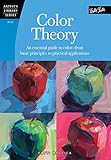 | Color Theory: An Essential Guide to Color, From Basic Principles to Practical Applications (Artist’s… | $6.99 | Buy on Amazon |
conclusion
Color is one of the important tools that designers love. Understanding color theory will help you use color wheels and color schemes wisely. Colors can be difficult to master, but the rules and guidelines of color theory can help you choose colors that complement the graphics you use.
You can also explore the benefits of color psychology in marketing.


![How to set up a Raspberry Pi web server in 2021 [Guide]](https://i0.wp.com/pcmanabu.com/wp-content/uploads/2019/10/web-server-02-309x198.png?w=1200&resize=1200,0&ssl=1)

")


 in Roblox")
")


")


")


")
