Companies around the world use Pareto chart analysis to identify business impacts and their relative impacts. This will help you overcome various limitations and steadily achieve perfection.
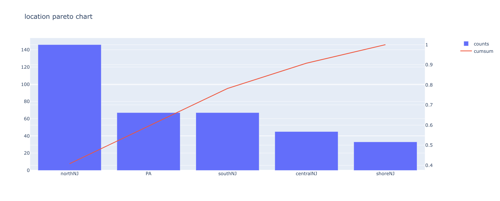
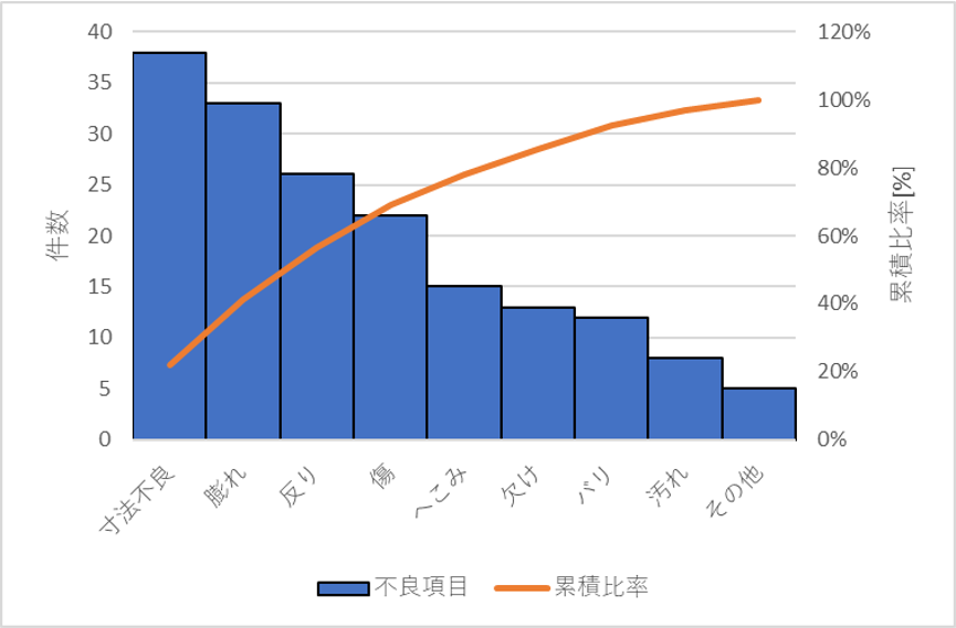
A Pareto chart is a special case of a bar chart combined with a line chart. This is a graph where the bars represent discrete values in descending order and the line graph represents the cumulative sum.
This graph is based on the Pareto principle, which states that 80% of effects come from 20% of causes. Italian economist Vilfredo Pareto supported this view. This diagram is called a Pareto chart because it is based on the Pareto principle.

Simply put, a Pareto chart allows you to determine the frequency of an outcome and its cumulative effect. Using this chart, companies can determine their limitations and prioritize areas for early improvement.
Various components of a Pareto chart
Pareto charts have the following components or parameters for input:
- Bars and lines are the most basic components of a Pareto chart that represent data.
- Each bar represents a type of problem, defect, or result. The height of the bar represents the cost or frequency of occurrence.
- The bar represents the values of all categories in descending order. This means that the chart starts with the highest bar and ends with the shortest bar.
- The line indicates the cumulative percentage of defects.
How to use Pareto charts
You may want to analyze patterns that are negatively or positively impacting your business. Therefore, using the various resources and data available, Pareto chart analysis helps you determine business priorities effectively. The use of these charts is not limited to any particular industry. It can be applied in a wide range of fields. Its applications include:
- Identify the areas where the biggest problems with the quality of your business products or services occur.
- Explore and leverage larger customer accounts to maximize sales.
- Resolve service or product complaint issues by analyzing problem occurrence and frequency.
- Prioritize key areas where your business needs immediate improvement to satisfy your customers and business partners.
- Explore business opportunities, including analysis of key funding reasons and key reasons for traffic to your business.
Let’s look at an example to better understand the usage of Pareto chart. This is perfect for project managers who:
- Identify the 20% of tasks that impact your project. You can prioritize later based on high or low impact.
- Identify the 20% of tasks that take the most time to complete. Therefore, project managers can allocate more time to those tasks.
- Identify the 20% of risks or consequences that have the greatest impact on your business. After this identification, a plan can be prepared to eliminate the impact of those risks.
How do I create a Pareto chart?
The steps to create a Pareto chart are as follows.
- Determine specific categories of different causes and factors and group them according to those categories.
- Select the appropriate measurement type (cost, frequency, quantity, etc.).
- The next step is to determine the time of the week, day, hour, etc.
- For each category of cause or factor, use the collected data to calculate subtotals.
- Next, create the bars so that the tallest bar is on the left and the smallest bar is on the right.
- For each category in the subtotal, calculate the percentage by dividing by the sum of all category values.
- I need to calculate the cumulative sum from left to right and draw a line graph. This represents the sum as a percentage.
Here are some of the best tools to create Pareto charts.
![How to create a Pareto chart [5 tools]](https://kazu2017.com/wp-content/uploads/2022/05/20-1-1024x517.png)
visual paradigm
VisualParadigm provides an online Pareto chart maker that quickly analyzes and converts your data into Pareto charts. There are several chart templates that you can customize and add personalized data. It offers a large collection of icons and photos to spice up your designs. Easily adjust chart values using drag-and-drop tools.
The VisualParadigm collection includes over 50 professional chart types to choose from for your project. You can also apply appropriate effects to your charts to match your brand. This Pareto chart maker allows you to easily publish, download, and share your graphs online.
mask cracker
Mathcracker is a graphical tool that helps you create Pareto charts online. Simply enter your data into the text boxes provided on this portal. A graph will be created in seconds based on the data you enter.
Its online interface has three text boxes in which you can enter data. The first text box requires data to be entered in the form of comma-separated values. In the second text box, you will be asked to enter the categories separated by commas. The third text box is for the title. The first field is required to create a Pareto chart. The other two fields are optional.
chart expo
ChartExpo is available for download in two versions. One is for visualizing data in Google Sheets and the second is for MS Excel. Both versions are paid on a monthly basis. You can try either of these two versions during a 7-day trial period.
The ChartExpo tool allows you to easily visualize your data in Pareto chart format to aid in decision making. Easily customize your graphs and publish them on your blog, website, and more. Interpret your Google Sheets or Excel data and create Pareto charts in just a few clicks.
Q chart
Qtcharts is an easy-to-use Pareto chart maker that allows you to enter data online and create charts instantly. This online tool comes with predefined fields that you need to add your data to.

Qtcharts also offers downloadable desktop and mobile software to help you create charts. This software is available for free and provides the easiest way to quickly create charts without watermarks.
creatively
Creately offers beautiful Pareto chart templates that you can customize according to your data. Chart templates are available as diagrams that can be edited with a simple diagram editor. You can export the resulting charts in multiple image formats.
To edit this Pareto chart template, sign up to Creately or sign in if you’re an existing user. Now you need to edit the template with your own values. Your chart is now ready to download.
conclusion
Pareto charts are very effective in improving business constraints and identifying opportunities. Creating a Pareto chart will no longer be a hassle if you consider choosing these efficient tools. So, take advantage of these amazing tools to visualize your data in the most effective way.


![How to set up a Raspberry Pi web server in 2021 [Guide]](https://i0.wp.com/pcmanabu.com/wp-content/uploads/2019/10/web-server-02-309x198.png?w=1200&resize=1200,0&ssl=1)

")


 in Roblox")
")


")


")


")
